The history of Soviet moonshine and vodka labels

In 2003, Russian vodka celebrated its 500th anniversary. In addition to large-scale festivities, the opening of a museum dedicated to the national drink (however, it is far from the only one in the country) was timed to coincide with this event in Moscow.
If you want to see the metamorphosis of Soviet labels with your own eyes, it's time to go there. For those who prefer virtual travel, Vzboltai has prepared a detailed article on the design of vodka bottles in the Soviet era.
Transition from tsarist times to the Soviet era
The design of alcohol in the pre-revolutionary period depended on the clientele for whom the drink was intended. On vodka- moonshine for ordinary people, plain labels with brief information about the product, volume, and manufacturer were used.
Bottles intended for representatives of noble circles were decorated with colored drawings, gilding, monograms, and other "beauties," and even poured into figured vessels.
With the advent of Soviet power, "bourgeois vestiges" became a thing of the past. Vodka labels became standardized - strictly oval or rectangular in shape, and customers were no longer divided into rich and poor.
Flat printing machines based on primitive dyes were used to replicate the labels, later they were replaced by modern flexography, which expanded the color range.
However, Soviet labels cannot be called uniform. Each of them had its own history and design.
Russian vodka: double label
Vodka under the Russkaya brand was first produced in the USSR in the 60s. The trademark was registered only in 1969, but before that, the drink had already won its first gold medal (at an exhibition in Leipzig). What follows is more: growing production volumes and new awards every year.
It is noteworthy that the popular Soviet vodka had two labels at once:
p>One depicted two mounted Russian knights proudly marching under a green banner in search of feats.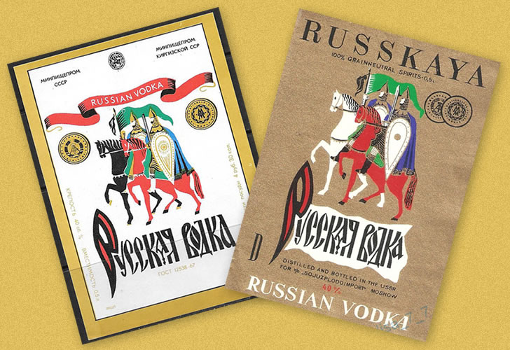
The second one was decorated with a simple blue inscription "Russian vodka" with antique stylization. The nondescript label was complemented by a golden frame and the words "RUSSKAYA" (above) and "RUSSIAN VODKA" (below). From time to time, images of medals received in Leipzig and Plovdiv appeared on a white background. By the way, this option turned out to be the most viable: something similar can be seen on modern samples of "the very Russian vodka".

Double labels for alcohol from the USSR were rare, if not an isolated case. It is assumed that the prototype of both versions was the initial sketch, which included a warrior and an ornate (in the Slavic manner) inscription. But it did not take root, and gave birth to two labels at once, which coexisted peacefully for more than a quarter of a century.
During perestroika, the bottle of Russkaya went through many transformations: the inscriptions on it appeared and disappeared, were translated into national languages, and the knights were later replaced by Russian heroes and other national symbols...
Interesting: One of the popular design options for Russian vodka was the use of Vasnetsov's famous work - the one depicting Alyosha Popovich, Dobrynya Nikitich and Ilya Muromets. The label reads "Three Heroes," although the painting is actually called "The Heroes.". In the post-Soviet era, other masterpieces of national art appeared on the bottles of the famous vodka: paintings by Perov, Kustodiev, and Savrasov.
Wheat. The first nominal
One of the oldest Soviet vodkas (produced before the war) was the first to get its own name. The rest of the analogues were simply called "vodkas" with the strength indicated: 40, 50, 56 degrees.
The pre-war label of Pshenychna was the most ordinary: no pictures or decorations - only text on a white background. After the war, it was forgotten in the wake of the popularity of Russkaya and Stolichnaya and was remembered only in the 70s. It was at this time that "Pshenychna" acquired its original colorful label. The image depicts a typical rural landscape with leaning houses, green trees and a bread field.
It is noteworthy that in different Soviet republics, the label of "Pshenychna" had the same look, but with its own peculiarities. For example, on Russian territory, the sky was absolutely clear, on Latvian and Belarusian territory - with a light haze, in Uzbekistan - with clouds, and in Kazakhstan - it was a sign of a thunderstorm.

Capital: mysterious and revolutionary
One of the most famous and mysterious vodkas of the USSR. Historians are still arguing about the date of its release. Someone claims that the first batch was bottled in the siege of Leningrad, someone is sure that it happened in the 50s in Moscow. However, everyone agrees that the author of the recipe was the distiller Viktor Svyryda.
But the label is not clear. Two people claim to be the authors of the drawing: the artist Andrei Johanson, who became famous for creating political posters, and Vladimir Yakovlev, an employee of Soyuzprodoproformlenie. There is no exact information, but it is possible that both specialists worked on the creation of the sketch.
The choice of the object is also unusual: the Stolichny label depicts the newly opened Moscow Hotel, and it is depicted in a composite image that combines views from different angles. Due to this approach and the mediocre print quality, not all Soviet people could recognize the famous building in the picture.
However, for its time, the label of Stolichnaya was truly revolutionary (and until the early 90s, the only one with an architectural image). Its uniqueness is confirmed by the fact that it is mentioned in the famous work "All About Packaging" by Thomas Hein. No other Soviet label has received this honor.
Most likely, the new hotel was put on the bottle of Stolichna as a recognizable symbol of a growing state. But there is an alternative, spy version of this story, which claims that Beria's involvement was not without significance.
Legend has it that the head of the NKVD used to "advertise" the hotel among the Soviet elite in this way to lure as many customers as possible and listen to conversations using devices placed in the rooms.

Ambassador vodka
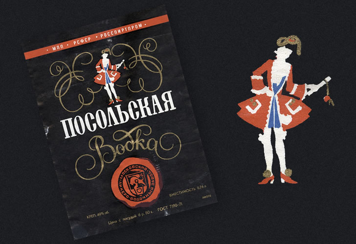
It was developed in the USSR in the early 70s and, as the name suggests, was actively exported abroad. Among its analogues, it stood out for its particularly mild taste and high drinkability, which was explained by a special approach to purification. Skim milk, coal and quartz sand were used in the processing of the product.
The label was also quite original - in black colors with an image of a man in a red Peter the Great outfit. The perestroika trends brought innovations to its design: drawings on the theme of the presentation of credentials, processions of embassy workers, warrior horsemen and even Kramsky's "Stranger" appeared on the bottle.
Siberian vodka
Also released in the early 70s and also with a pro-Western design. As a true Siberian, it turned out to be as much as 5 degrees hotter (45 instead of the embassy's 40). As for the label, everything is predictable: the standard image of Russia for the European consumer is snow, frost, a Russian three-bell shirt, a pitman driving horses, and a traveling couple of gentlemen... The picture was complemented by Russian and English inscriptions. By the way, Siberian vodka was supplied not only to the West, but was also popular among Soviet citizens.

Moscow special vodka
One of the most titled Soviet vodkas: it has won many medals, including at major international exhibitions. When developing the recipe, the pre-revolutionary version was taken as a basis.
The name has changed slightly (originally the vodka was called "Moscow special". Residents of the Soviet republics remembered the product because of the green label, which was striking. Because of this brightness, most anti-alcohol Soviet posters depicted Moskovskaya.
However, the color could vary significantly depending on the available dye: olive and light green were also available. The width of the colored stripe also varied, which could occupy from 20 to 60% of the label. In different years, the bottle of "Moskovskaya" was decorated with a golden frame, images of medals, factory logos, etc. д.

Golden ring vodka
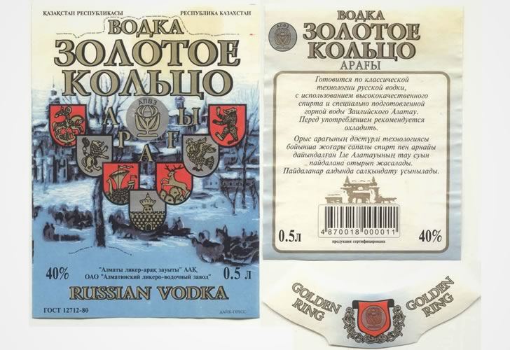
The first so-called "elite" vodka in the USSR. Appeared after the invention of the "Lux" category of improved purification alcohol. The design, as well as the name, actively exploited the tourist theme: snowy expanses, churches, monasteries, horse-drawn carts and ancient coats of arms of Russian cities.
The author of the sketch was later severely criticized for the incorrect depiction of these same coats of arms, which, however, did not prevent the new vodka from earning popular recognition. This was confirmed by the release in 1980 of a beer of the same name dedicated to the XXII Olympic Games.
Hunting vodka
Appeared in the late 50s, it was characterized by increased strength (45 degrees), which was necessary for quick warming of hunters frozen in the forest. The label originally featured a running deer, the image of which differed from one factory to another.
In the late 60s, it was replaced by a black grouse against the background of a bright sun disk. It is not known what caused this substitution, but it was customary to eat hunting sausage as an appetizer for the new vodka.
In the 80s, "Hunting" vodka was exported to the West, providing it with two names at once: "Okhotnichya" (according to the original) and "Hunters brandy" (for greater clarity among foreigners). And just in case, we added a large font: "RUSSIAN VODKA".

Labels of high-degree drinks
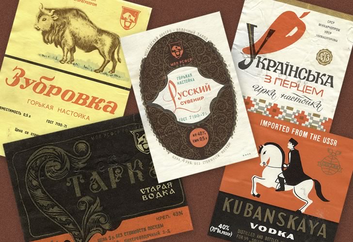
In addition to vodka, the USSR produced other strong alcohol: bitter and sweet tinctures, pure alcohol. Their labels were not particularly diverse or original: the bottles of Lemon Tincture featured a lemon, Pepper Tincture was decorated with pepper, and Zubrivka was decorated with a bison.
Alcohol contains only the name, degree of strength and the most general characteristics. The bottle of Starkey, inscribed with ornate letters and later supplemented with monograms, looked a bit more interesting.
Update: 10.12.2019
Category: Vodka an Moonshine